Multi tasking, misinterpreting and overlooking. Three common reasons that instructions aren’t always executed properly.
In a hospital, it may cause an avoidable medical error. Drug label information may be mistaken in both medical and veterinary offices. Or simple paperwork, a signature from a department head or client is missed, causing an unnecessary delay in completing time sensitive information.
But with the work challenges and distractions that confront employees in all businesses, how do you ensure that staff follows certain procedures and help guide outcomes?
Although there is no magic formula that guarantees success, the simple use of color is one solution.
Masahiro Kawasaki and Yoko Yamaguchi (2011), professors at Kyoto University in Japan, conducted extensive research on how color impacts behavior. They exposed people to various colors, and they studied their brains through an EEG. When a favorite color was present in the background, their brains became activated before they consciously noticed it. Color subconsciously captures our attention.
Although it won’t cure unproductive multitasking habits, using color effectively helps you influence behaviors and increase the impact of your message. For example:
-
Red - Draw attention to something that is important or something that shouldn’t be done.
-
Orange - Invite to do something.
-
Yellow - Highlights points that should be remembered. It stimulates mental activity.
Plus, when using more than one color, combining them in certain ways can enhance the meaning.
-
Use complementary or opposite sides of the color spectrum, when you want to highlight the difference between things.
-
Using analogous color, ones next to each other in the color wheel, to create harmony. One dominating and two supporting colors make information stand out.
-
Use monochromatic color scheme, different shades and tones within a specific hue, for grouping similar objects or facts.
And, when you use a lighter background, it increases the readability level.
Although these steps can guide behaviors, some colors have additional meaning to a company or industry. For example, yellow is associated with a fall risk in hospitals so these guidelines should always be used in conjunction with your own standards.
Communication Labels
|
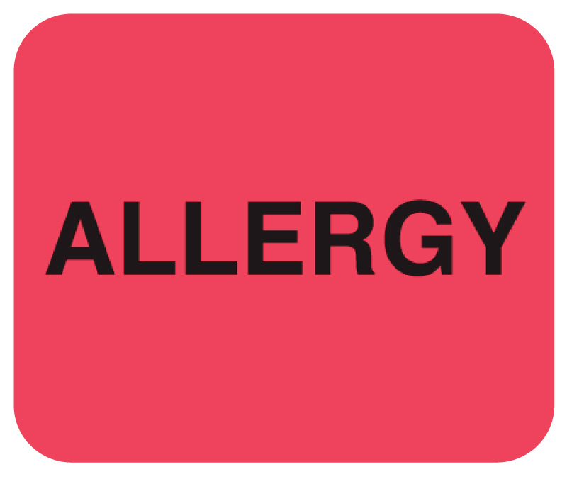
United Ad Label uses these color schemes to design labels that guide behavior. For example, processes that impact patient safety, such as allergies, in hospitals,
Medication dispensing in a Veterinary office,
And drawing attention to signatures on important paperwork,
Are all emphasized using red backgrounds. |
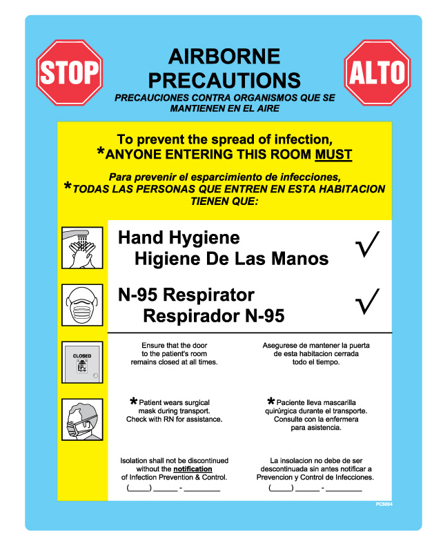
While information that needs to be remembered such as,
Infection prevention steps,
Board and care instructions
And even friendly reminders to submit an overdue payment use yellow highlights. |
Custom Label Design
Using meaningful copy or wording is the most important criteria when developing a custom label. However applying effective design standards and these same color guidelines will help you build a better communication.
With label materials and inks available in colors throughout the spectrum, you can easily adapt your label to maximize it’s impact.
In addition, stay away from other color combinations. Avoid using a dark color type on a dark background, like black and blue. Or conversely, light color type on a light background, like white and yellow. Both options make the copy very difficult to read.
However, there are online tools you can use to review and assess your label design. The United Ad Label Custom Label Designer is an example of an online system that allows you to design and review a label to ensure it works the way you intended.
Take a look at the United Ad Label Catalog to order communication labels that use color schemes to impact understanding and action. Unfortunately, there’s no guarantee that an employee or customer executes instructions appropriately, but by using color in appropriate ways, you’ll increase the odds of success.


